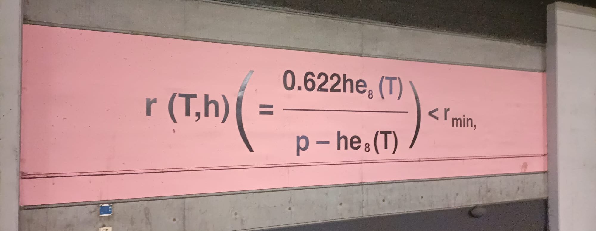
A bunch of random physics formulas, with different background colors, painted over the walls of Gare du Nord. It is an “Art” piece. So be it, why does it bother you?
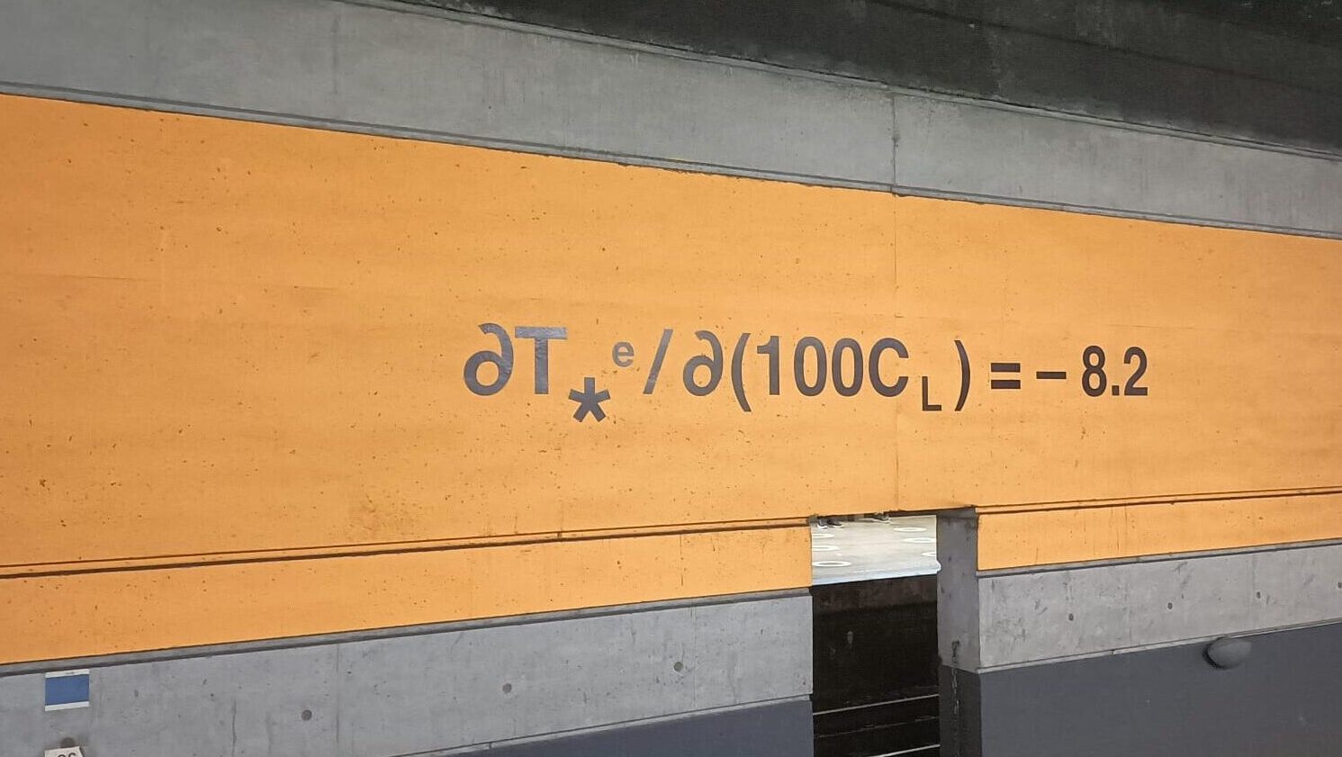
It bothers me as a scientist living in a world where people are educated to be scared of science. Do we really need one more piece of art that simply reminds them they can never understand what physics is talking about? What’s worse: This art piece is claiming to raise awareness on climate change!
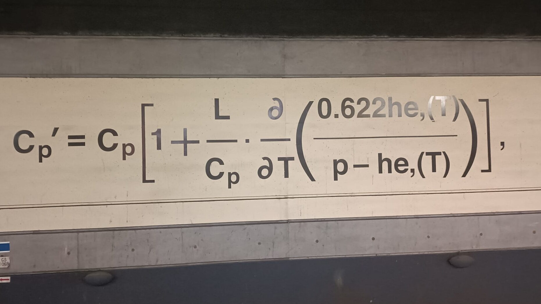
The artwork mentioned is “The Logical Basis” by Liam Gillick, delivered for the COP21 climate conference in Paris in 2015. The formulas are taken from scientific articles published by Syukuro Manabe.
I will focus on this artwork to question the effects of art, and use it to illustrate the problems of science-inspired art in general.
THE PROBLEM
“I never understand physics…”
“I don’t have a brain for science…”
Such sentiments are expressed by too many people. There are a lot of things to criticise about the formal education, and it’s hard to summarize it here, but we can draw one aspect of these many problems that is related to our topic: Formulas. People are misled to think that physics is a bunch of formulas. And then if they don’t understand the formulas, they think they don’t understand physics.
Formulas are nothing but tools to symbolize relationships between quantities. They are only symbols, they have no essence without a context, without an explanation. Meaning is not in the symbols, but in the relations they represent in a given context.
Scientists communicate in the same way as any human does. By forming phrases, paragraphs, telling stories. Each time an article is written, a lot of thought goes into how to structure that text in a clear way, how to make things as understandable as possible. Formulas are part of that narrative, but no more privileged than any other word of that text.
There may be lots of scientific discussion, even without the use of any formulas. You know what? Here is a paper by the same scientist mentioned, where the author did not even use any formulas in the discussion.
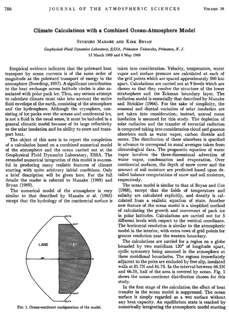
How about the papers that formulas come from? The author is always kind enough to explain what any symbol represents, in a very clear way.
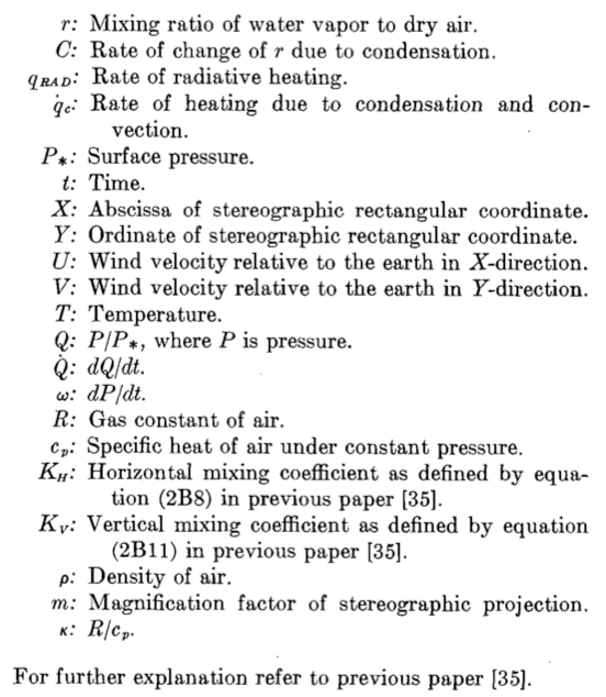
From [2]
That’s his job, that’s his passion, that’s his purpose. Ultimately, the scientist wants to make people understand the problem of the climate.
Science is understandable. It is about transforming complex situations into simple components. So why would an artist attempt to do the opposite?
MYSTICISM
The answer is: The artist profits from such activity. To understand it, we can visit back the art of the Cold War era and what kind of art pieces were promoted by the ruling institutions of the West. Since that time, the less people it corresponded to, the bigger value the artwork gained. The meanings embedded in a piece of art became a secret code between an elite society of people.
The attitude continues, in a similar way, in the artworks involving science. At all levels of the production of such project, the attitude repeats itself. When the artist pitches their artwork to a bunch of sponsors, the effort is not about how well the science is transmitted but instead it’s about how much the artist claims authority in the subject. When the project is funded, it doesn’t matter whether the project is actually meaningful, as long as it makes a statement that the sponsors prove that they “care” about science (or environment). When it’s finally posted on a wall, nobody worries about whether it has a positive impact on the audience, as long as its subtext is approved by critics.
In the end, the artwork represents the authority of the artist, and the obedience of the audience. The audience may be convinced that whatever those formulas represent are important, that they have value. Independent of the accuracy of the scientific message that is intended, this kind of relationship between people and science is something we criticise. We don’t want the people to just obey whatever science says. We want them to grasp it.
OTHER PROBLEMS WITH THIS ART
There are some other problems in this artwork that deserve some mentioning. As respected scientist Syukuro Manabe is, his name is not a representation of the collective consensus that gives the science its value. Reducing it to an individuality also feeds an important misconception of science. Scientific process does not progress with the miraculous achievements of a few geniuses. It does by a collective effort of millions, with every little effort, every step, every failure counts. It is important for the public to understand the value of the mistakes on the path to the truth. The way that science is represented in media, with its glorious success and its heroes, also contribute to its discreditablity and mistrust when those myths fail to hold. No matter how smart, no individual is ‘scientific’ by essence. What makes any individual scientific is related to the way that individual connects to the rest of the community.
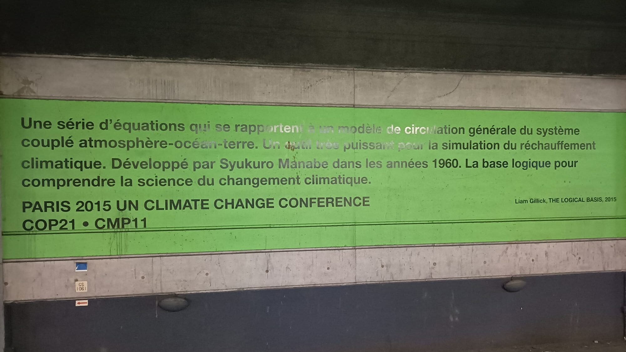
Finally, the last problem about this art is about the way it’s sponsored. COP21 was a conference that served to ‘greenwash’ the activities of western states and in terms of climate awareness, all this artwork did was to contribute to that stunt. The establishment will never actually try to solve the problems, at it would mean its giving up of its own power. Instead, it will do anything to extract profit and benefit out of the situation. We are yet to see a lot more of such investment towards this goal, consuming any resources without question.
ART FOR THE SCIENCE
As scientists who care about the people to understand our work, we find art to be the most important tool in reaching out. That is why it is important to evaluate the position of each artwork in this communication. When a piece of art that reinforces the existing prejudice against science that it is complicated and difficult, its harm absolutely dominates over any good it can claim. We don’t want to just give people “knowledge” of scientific facts. We want them to understand its philosophy, its methods, and we want to encourage them to use it as a guide in life, no matter what kind of lives they have. Most importantly, we want them to be confident, and to believe in their intellect.
SOME OTHER EXAMPLES
We can illustrate a lot of examples of art that uses science concepts, techno babble, etc… without actually having any relation to what that word represents. With possible exceptions, browse the sea of works with a name like “Quantum”, “Ether”, “Gravity”… or works claimed to be related to “Supersymmetry”, “Cosmic Particles”, “Dark Matter”, “AI”, “Deep Learning”, “Blockchain”… A majority of them use these words to just “package” the project, without any liability for any connection between the concepts and the actual work, let alone its understandability.
Certainly over time we may pick another one to focus the light on a specific observation. But what we want to do now is to illustrate examples of the contrary, so that we prove we’re not just a bunch of grumpy Scrooges who complain about colorful things.
An example is the work of Memo Akten. Many of his works gain its value from their clarity and simplicity rather than mystery. A specific example of those is the Simple Harmonic Motion, which illustrates how a simple mechanism can lead to a very interesting outcome, and motivates curiosity in a very basic concept of physics instead of a hype one. In addition, most of his works are open-sourced, which contributes to their educational and empowering aspect.
Another artist we can refer to is Nicky Case, all their work is very artistic and educational at the same time. Furthermore, they compiled other artists’ work in a hub called Explorable Explanations, to promote such projects.
If these examples are too “educational”, let’s try to expand the spectrum and show that it is possible to be uplifting and aesthetic in very diverse ways. Some works of Maxime Causeret can be considered to be so, we can take as an example the music video for Max Cooper’s “Order from Chaos”. It tells a story, completely imaginary, yet in a way that encourages our minds for their capability of grasping the reality.
IN CONCLUSION
While the examples given are from very different media, a common point we can spot is that they all paint a “process” instead of a “concept”. This is not a coincidence, as science is more about the processes that things undergo, than just names of things regardless of a context. It is about the relative instead of the absolute, it is about the emergence of contrasts. It has a path from simple to the complex, as well as vice versa. The picture of this, is always more beautiful in terms of a scientific aesthetic, than the naturmort of an abstraction.
It is harder to find an example of “good science art” than to find an example of “scientific gibberish”. It is because the art market favors a certain attitude of the artist, for the reasons mentioned above. Therefore, one last note to deepen the contrast:
If you want to see science and techno gibberish, you can look at fanciest galleries, giant billboards, commercial center LED screens, enterprise buildings, million dollar projects.
If you want to find good science art, you will have to dig out blogs, vlogs, webpages, workshops, or the struggling artist in your town.
References
[1] “Climate Calculations with a Combined Ocean-Atmosphere Model”, Manabe S., Bryan K., 1969
[2] “Simulated climatology of a general circulation model with a hydrologic cycle”, Manabe S., Smagorinsky J., Strickler R. F. 1965
